VALORANT: Sacrificing User Experience for Better Visuals.
By George Marei
-
Overview.
Evaluate Valorant’s new UI changes to better understand and document correlation between experience & visual design.
-
Scope.
A single case-study to follow product and design processes to identify solutioning opportunities for design intervention.
-
Goals.
Identify problems with new UI & propose potential solutions using human-driven design decisions.

Riot Games introduced a new UI overhaul to the menus found inside their wildly successful first person shooter, Valorant, during the release of their 5.08 patch on October 17th, 2022. The change was met with mixed reviews, but one thing was for certain, it was vastly different from what players were used to.
Let’s take a closer look at the problem.
Examining recent rank distribution charts among Valorant’s player-base, we find that the majority of players fall under the lower ranks, ie. silver & gold. For this reason (excluding factors such as game-type & team stacking), we can conclude that queue times for games are considerably decreased within this elo.
We need to then ask the question, who are we designing for? Riot adding in extra functionality only works in higher ranks where players have more time to navigate these menus. But the majority of players are in the lower ranks, and therefore, this is the player we should be focused on.
Why not complete your actions, and then queue up for a game when you’re done?
Assuming most players will be co-operatively participating with friends in the same group, the player will not always be in control of queueing up, and is under pressure to maintain momentum for the rest of the group. ”If the majority of the player-base is finding games before they have time to navigate the menu & accomplish a goal, wether it be activating an agent contract, equipping a skin in their collection, or even completing a purchase in the store, then your menu experience is failing.
User Interviews & what Players are saying.
“I don’t care about seeing skins that I don’t have. I want to go in there and see my options based on skins I own. Before, I could just open up the weapons screen, press ‘show owned only’, but now I have to open up an entire new menu, which is a little confusing, and click around a bunch to do the same thing… why?”
— Valorant Player
“What’s the point in favouriting weapons, when every time I open the collections screen, I have to go through the ‘edit filters’ box to be able to see which weapons I favourited? It seems redundant and a waste of time. The options inside the edit filters box are interesting, but a little confusing overall and not all that useful to me.”
— Valorant Player
“I don't like that they took out ‘owned’ checkbox for banners as well. There's so much text on the left that I almost don't see the 'store' text. it's quicker to click play -> top right, nothing is consistent throughout the menus.”
— Valorant Player
Speaking to players, I was able to identify two key themes that emerged from expressed pain-points & behaviours. I synthesized the learnings into actionable items below.
-
Information Architecture.
Information architecture should be designed around the least amount of friction for quickest navigation opportunities.
-
Consistency of Components.
Components should follow consistent communication style through visual design and function for seamless transition throughout experience.

HOW MIGHT WE SUPPORT USERS IN ACCOMPLISHING THEIR GOALS IN BETWEEN GAMES, AS QUICKLY & EFFICIENTLY AS POSSIBLE, SO THEY CAN REMAIN ENGAGED & MOTIVATED?
Thinking Like a Player.
Seeing as equipping weapon skins was a reoccurring pain-point among players, I elected “Viewing & Selecting Owned Skins” as my Core Epic for this Case-Study.
I’ve created Task Flow Diagrams to illustrate the differences in actions during the 5.08 Update required to fulfill this Epic.
Pre 5.08 Update
Post 5.08 Update
01
02
What does our solution look like?

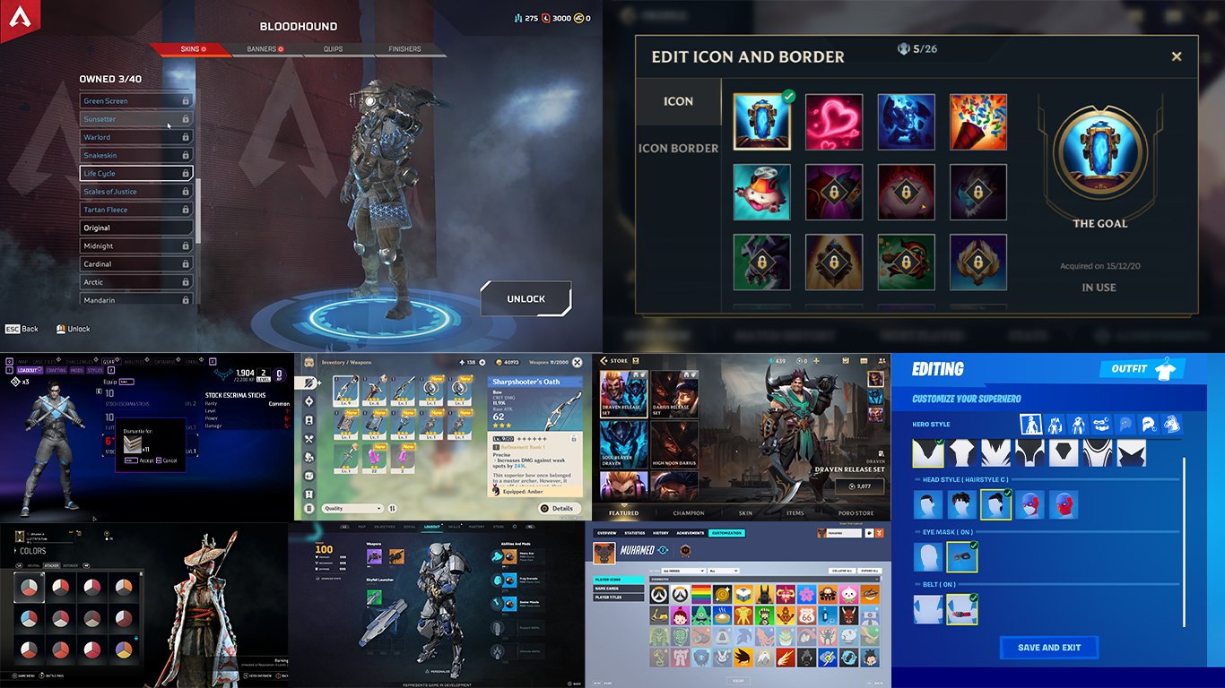
The first step is to collect inspiration for my UI changes. For this I turned to the most praised/ talked about experiences in gaming to better understand what makes them successful.
What I found:
-
Affordance.
Toggles, buttons, and option controls have visual characteristics that make it easy for users to understand how the various objects work. Familiar functionality through visual language.
-
Flow.
When a player is addicted to your game, they don’t want to scroll through a dozen pages to start playing again. They don’t want to watch the same animated segment over and over before they can return to the action.
-
Options.
Give your players high-functioning menu controls that navigate through reasonable numbers of options. Create menu interfaces that scroll effortlessly through choices and offer instant selection tools.
Based on what I learned from looking at inspiration. The “Collection” screen in Valorant’s menu follows affordance and provides high-functioning menu controls, but fails in the ‘Flow’ department. I began sketching to explore ways in which we could offer instant selection tools by replacing the “Edit Filters” modal and reducing actions required by the player to achieve their tasks/ goals.
High Fidelity
Finally, it’s time to bring our learnings & ideas to high fidelity mockups. This helps me better visualize how my ideas translate to real-world application, while also providing me a tool which I can use in further user-testing.
Original
Redesign
Iteration #1: Integrating ‘edit filters’ modal into Collection screen UI.
Iteration #2: Solving for ‘tiers’ option box covering the weapon.
Iteration #3: Solving for ‘tiers’ positioning & readability.
Just the beginning. Next steps moving forward.
I was able to explore and focus on my chosen epic for this project to propose better ways in which we could support the majority of the player base, in streamlining their experience and helping them stay immersed in the world of Valorant. This was only one potential solution, for one core epic. Next, I would like to turn my attention to more task flows, applying my learnings to the rest of the menus found within the game. I hope this case study has demonstrated how we can retain visual dynamism, while still being mindful of the User Experience.


